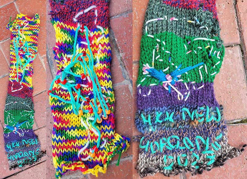
I created this Circular knitting machine data visualization using survey data created at the New Horizons in Digital Humanities & Cultural Data Science workshop at Hong Kong University (a type of Event Data, about how long (and from where) people had traveled to attend the event. I used yarn to embroider two maps (Geospatial Data), and used beads for people’s starting locations and transfer locations. One map was global, another was of Hong Kong. This visualization primarily uses color, as well as recreating an existing data visualization style (mapping).
There’s a detailed write-up of how I did it along with the afterlives of other craft supplies I brought with me to Hong Kong.