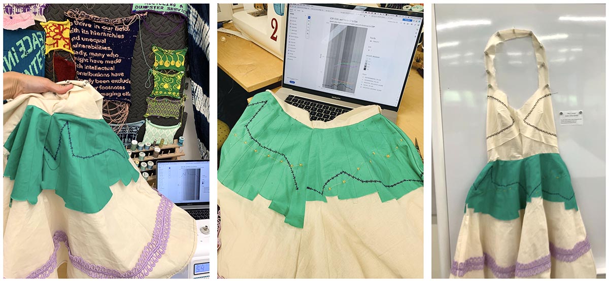
For her final project in Data Visualization with Textiles 2024, Aldis Elfarsdottir used multiple data sources (including Civic Data) to sew a dress with machine embroidered visualizations. This dress partially recreates computer-generated visualizations, but also uses the property of size to represent some of the data.
Over the past two years of my PhD, I have merged and analyzed three large datasets: the Carbon Disclosure Project 2010-2020 (CDP), the Environmental Protection Agency’s Toxic Release Inventory 2010-2022 (TRI), and Morgan Stanley Capital International ESG Scores for rating companies by their performance on Environmental Social and Governance criteria between 2013-2021 (ESG). I meticulously matched over 4,000 companies by name across these datasets to find out when and why they disclose their carbon emissions and sustainability initiatives; and how their ESG scores are impacted by voluntary and mandatory disclosures. Carbon Disclosure Project CDP is voluntary, while Toxic Release Inventory TRI is mandatory.
You’re probably familiar with companies’ “Sustainability” tabs on their websites and impact reports that say what they’re doing about climate change and how much they plan to reduce their carbon footprint by 2035 or 2050. The Carbon Disclosure Project is an organized survey that collects this kind of information from over 23,000 companies around the world. But voluntary provision of information is an opportunity for greenwashing – overstating efforts to mitigate climate impact, without any mandatory auditing or accountability.
Meanwhile, ESG raters are using lots of publicly available information about companies to determine scores, which means ESG scores are influenced by some greenwashing. People and investors then form opinions of firms based on what firms say about themselves and what raters say about firms. You can find ESG scores on Yahoo Finance, and you could even choose to only invest in highly-rated ESG stocks and bonds in your investment portfolio for retirement. But we want to know the extent to which ESG scores are influenced by greenwashing, and whether they can actually guide money to support the clean energy transition.
For my Data Visualization with Textiles project, I plotted my three sources of data by industry to see their interactions over time. As a template, I wrote code in R (pictured below) that plotted the proportion of companies in each industry group that participated in the Carbon Disclosure Project that year as a backdrop – with textual labels so I could be more precise with my textile measurements – with line plots for ESG scores and toxicity measures. My carbon disclosure and toxicity data go from 2010 to 2020, while the ESG scores we have access to are from 2013 to 2020.
Time is on the horizontal axis, while quantitative measures are on the vertical axis (see below). ESG scores are on a scale of 0 (worst) to 10 (best), and TRI toxicity is an aggregate measure of the pounds and grams of toxic chemicals that each company’s US-based facilities release into the air, land, or waterways; chemicals such as lead, arsenic, and cadmium. I measured carbon disclosure as a yes or no in any given year, and found the percentage of companies in each industry group that responded to CDP surveys that year.
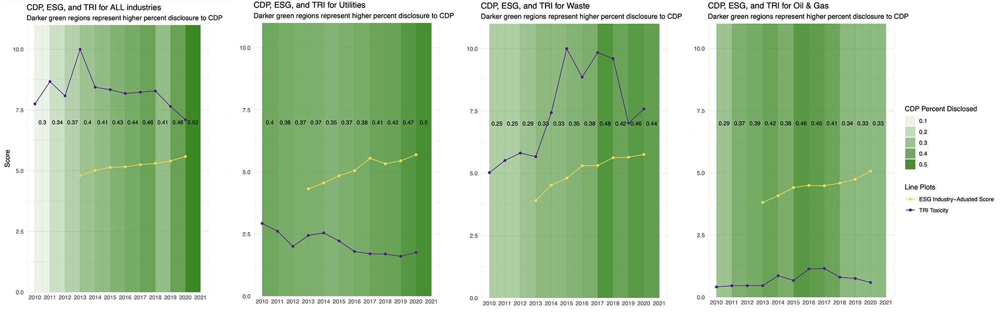
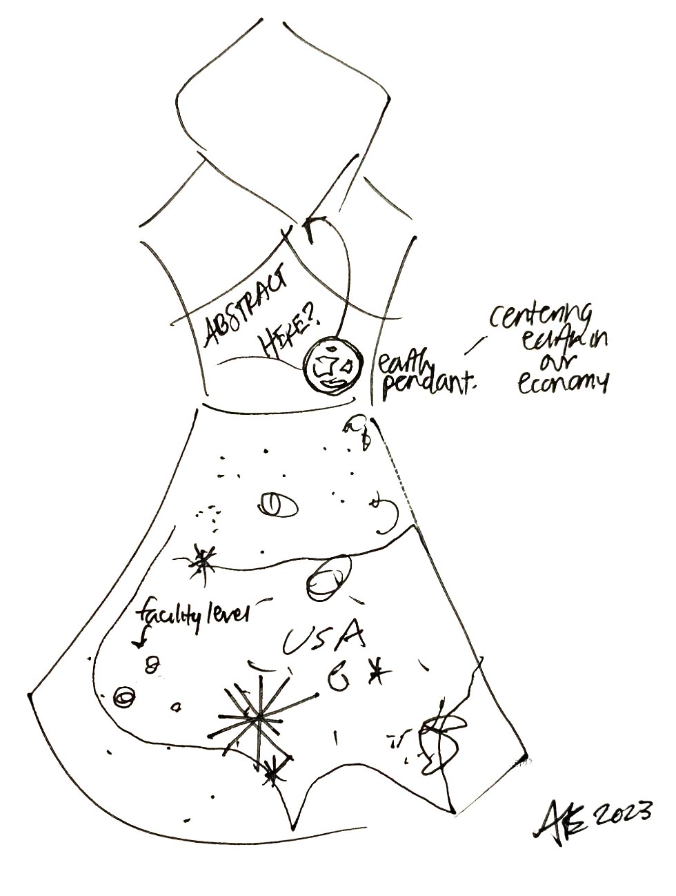
In the plots above and each dress skirt panel below, you will see carbon disclosures (green bars), ESG scores (yellow star line), and toxicity levels as reported to the EPA (purple asterisks line). For the four panels of my dress, I chose 4 industry groups: All Industries, Utilities, Waste, and Oil & Gas. “All Industries” also includes companies in Agriculture, Technical Services, Wholesale & Retail Trade, and Manufacturing.
Through processing my data for visualization, I learned that I had to simplify-simplify-simplify. I aggregated all facility-level data to the parent company level, and all monthly data to yearly data. I lumped any customized CDP responses to “yes-participated” and “no-didn’t participate.” I also learned from my communications class with Kelly McGonigal at the GSB that you have to walk people through the axes and what each line means, so I chose just three pieces of data to plot: one aspect of CDP (percent disclosures), one aspect of ESG (the industry-adjusted score), and one aspect of TRI (the total sum of toxic releases in pounds and grams).
Initially, I was going to layer lots of slightly transparent green fabric to demonstrate “layering on the thickness” of greenwashing/sustainability disclosures. But I figured that would be a lot more work than what I ended up doing: so I measured out a length of green fabric that roughly matched the skirt panels, then cut it down to size based on the percent of disclosures each year, for all companies in the same industry group (pictured below). Each quarter of the skirt panels represents data averaged across a different set of industries. In front to the left is “All Industries” and to the right is “Utilities”. In the back to the left is “Oil & Gas”, and to the right is “Waste”. The more green, the more potential greenwashing.
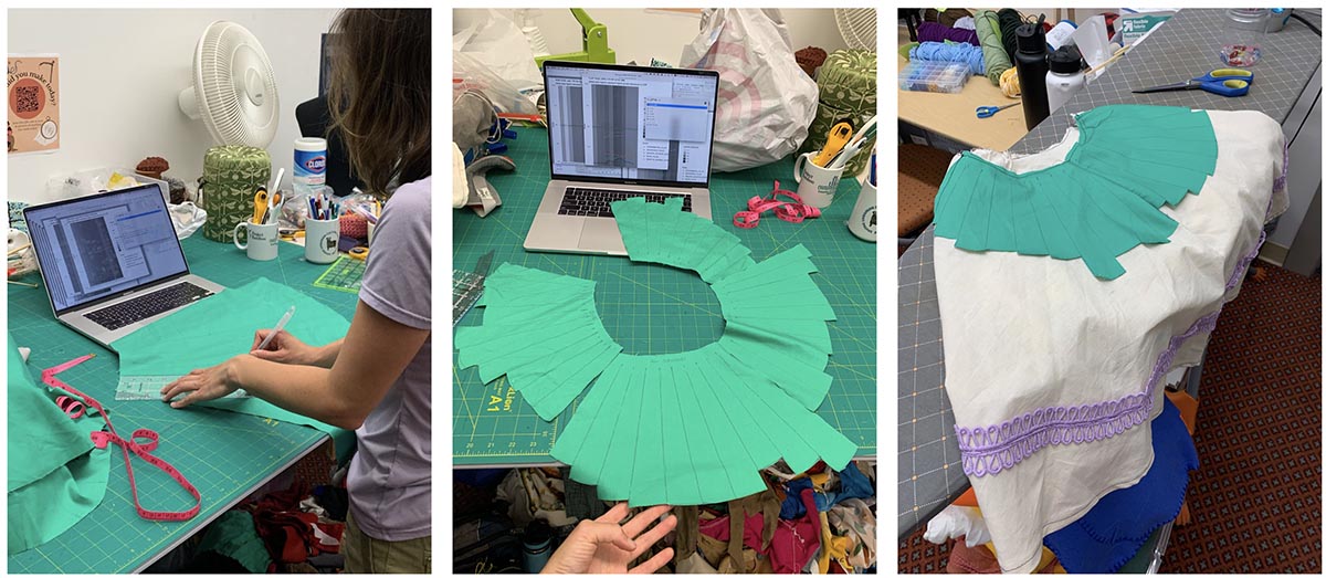
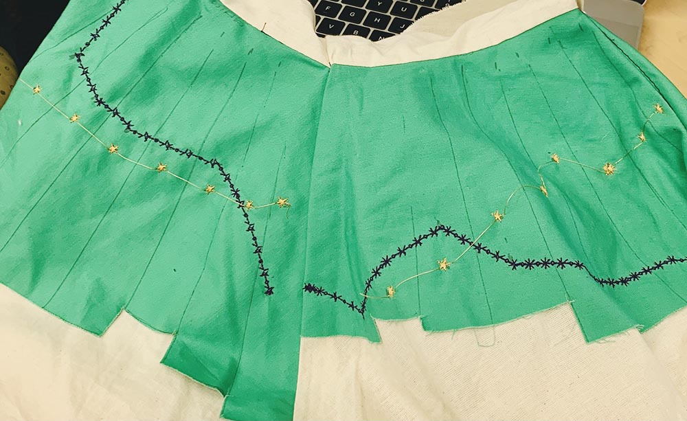
For the line plots of ESG scores and toxicity, I used a steam-erasable pen to mark the relative positioning of yearly values. I eyeballed these points, aiming to illustrate the relative year-on-year changes, as opposed to exact numerics. I also wanted to use the line plots to secure the disclosure patch of green fabric to the muslin backing. This worked out functionally and aesthetically, so all the data could be visually absorbed and understood in closer proximity. I chose different stitch patterns for each type of data – purple asterisks to represent toxicity and golden stars to represent ESG scores. I also chose to keep the golden thread between stars as a way to connect the yearly data points.
You will also notice butterfly stitches and a purple trim. The stitches are functional to bind the bodice together, while the purple trim is decorative, but also indicates the 100% disclosure line, since the full green panels extended down to that length from the waist.
If I were to entirely redo the dress (concept above), I would probably go a little more wild and not stick to classic 2-D plot visualizations. Perhaps I would lean into the 3-D and more tactile possibilities that textiles offer, like texture – roughness associated with higher toxicity, or fabric flower-like shapes increasing in size. Or I would highlight one particular “good” company in front and one particular “bad” company on the reverse of the dress. Instead of aggregating the toxicity data, I would randomly or roughly geographically plot out each metal and toxic compound like lead, cadmium, nickel etc. with buttons - and in no particular order, just let the densities and shapes speak for themselves as an accumulation over time in the making of the dress. Different fabrics like jean or corduroy could represent different industries: retail trade vs. agriculture.
But if I were to just modify a few things about my dress, I would embroider my abstract in symbols or words to the back panel of the bodice, and let out the fabric at the middle seam in front so it fits more comfortably.