For his final project for Data Visualization with Textiles 2024, Patrick Vasquez sewed a shirt using interaction data and the properties of color and quantity.
Data has been the hardest part of this class by far, much more than learning the skills necessary to work in the textile makerspace. Thus for the data that I used for this project, I kept it simple. I was inspired by the data set I had provided for the mid quarter assignment. The data I had submitted then was about the months my girlfriend and I had visited each other this last year.
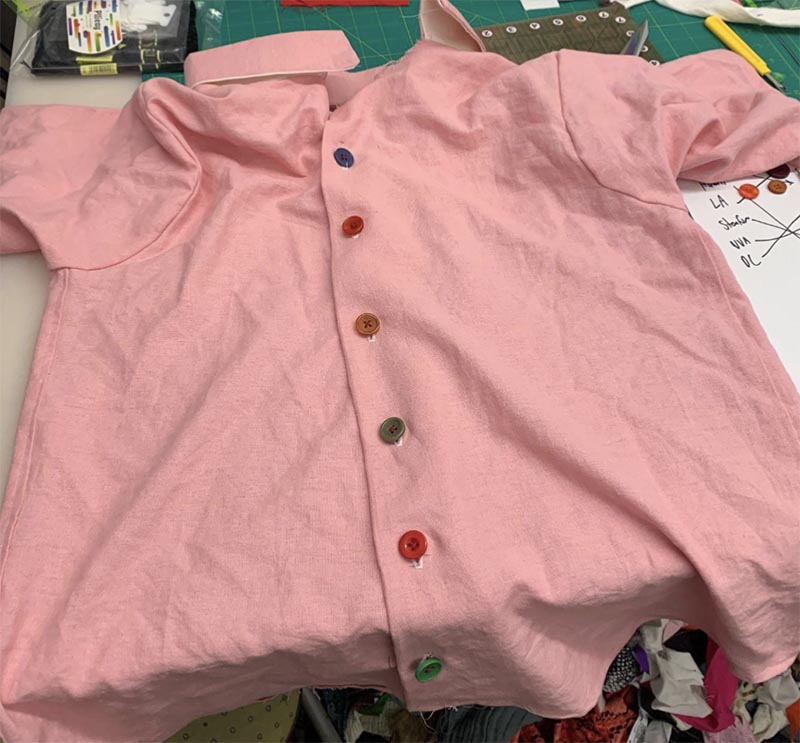
Since this shirt ended up being made for her since I could not fit into it due to a size downs because of a lack of fabric, I wanted the data to reflect that. I knew that whatever data I selected would be representative of the recipient. A major part of my relationship has been travel, evident by the amount of visits we’ve made to each other this last year. Thus, I wanted to immortalize some of the main ones made during our first six months.
I selected six different trips to represent six of the necessary buttons I would use for the shirt. The six locations, in chronological order of when we went there during our relationship were LA, where we are from, Boston, where I went to visit her during her internship last summer, DC where we met before going to her school, Virginia, where she goes to school, Stanford, where I go to school, and finally Hawaii, where we traveled for spring break. Each of these locations was represented by a button of a different color. Los Angeles was blue for the beaches, and I guess the Dodgers too if I think about it. Boston was Red for the Red Sox. DC was silver/gray for all the similarly colored government buildings. Virginia was orange since that is one of the colors of the University of Virginia. Stanford is of course a brighter cardinal red. Finally Hawaii was green to represent all the lush vegetation of the island.